Develop Widgets
Click Widget in the left sidebar to manage your self-developed widgets. Widgets are customizable components that can be implemented to serve a variety of purposes—such as solution dashboards, analytical tools, or interactive shortcuts that communicate with your graph data.
You can create widgets to streamline workflows, visualize query results, or provide users with quick access to common operations. Each widget can be tailored to specific use cases, making them a powerful way to extend the platform's functionality and deliver targeted experiences within your graph environment.
Create a Widget
Click New Widget to create a widget. You can click the Settings icon next to the widget name to rename it, edit its description, and upload a thumbnail image.
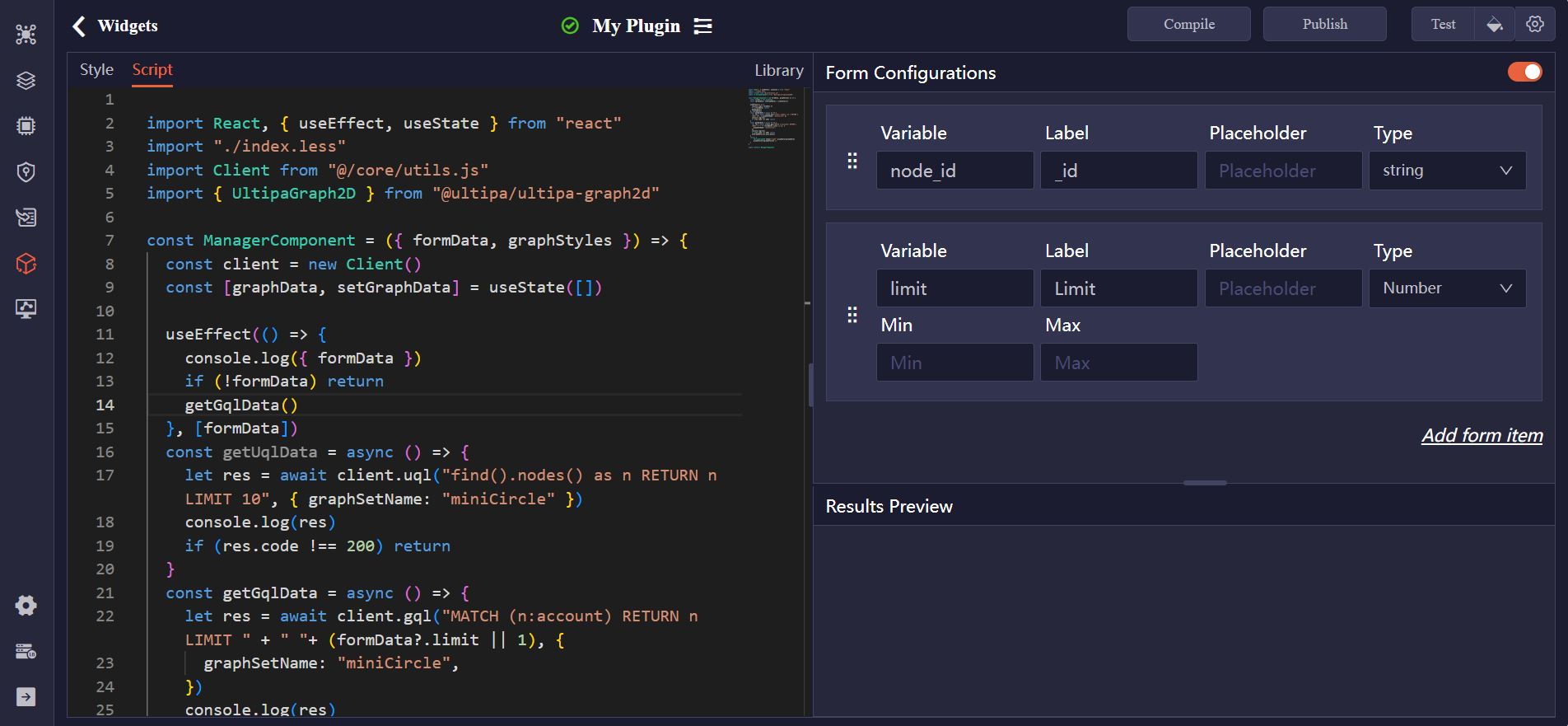
Code Editor
In the widget code editor, you'll find two tabs:
- Style: This tab is used to define the visual presentation of your widget using CSS. You can customize layout, colors, fonts, spacing, and other UI aspects to match your design requirements.
- Script: This tab is where you write the React-based JavaScript code that defines the logic and interactivity of your widget.
Form Configurations
You can create a form for your widget to capture user inputs, which will then be used within the script for various purposes, such as filtering data, adjusting settings, or triggering specific actions.
For each field in the form, configure the following:
Item | Description |
|---|---|
| Variable | The name of the variable, which can be referenced in the script as formData.<variable>. |
| Label | The label displayed to users alongside the input field. |
| Placeholder | Text shown inside the input field to guide user input. |
| Type | The type of the field (e.g., String, Number, Radio). |
Test a Widget
Click Compile to confirm that your widget is structurally valid and ready for use. Once compilation is successful, click Test to run the widget.
You can customize the user input by clicking the Settings icon next to the Test button. To apply a visual style to the retrieved nodes and edges, click the Style icon and select your preferred styling options.
The results will be displayed in the Results Preview pane.
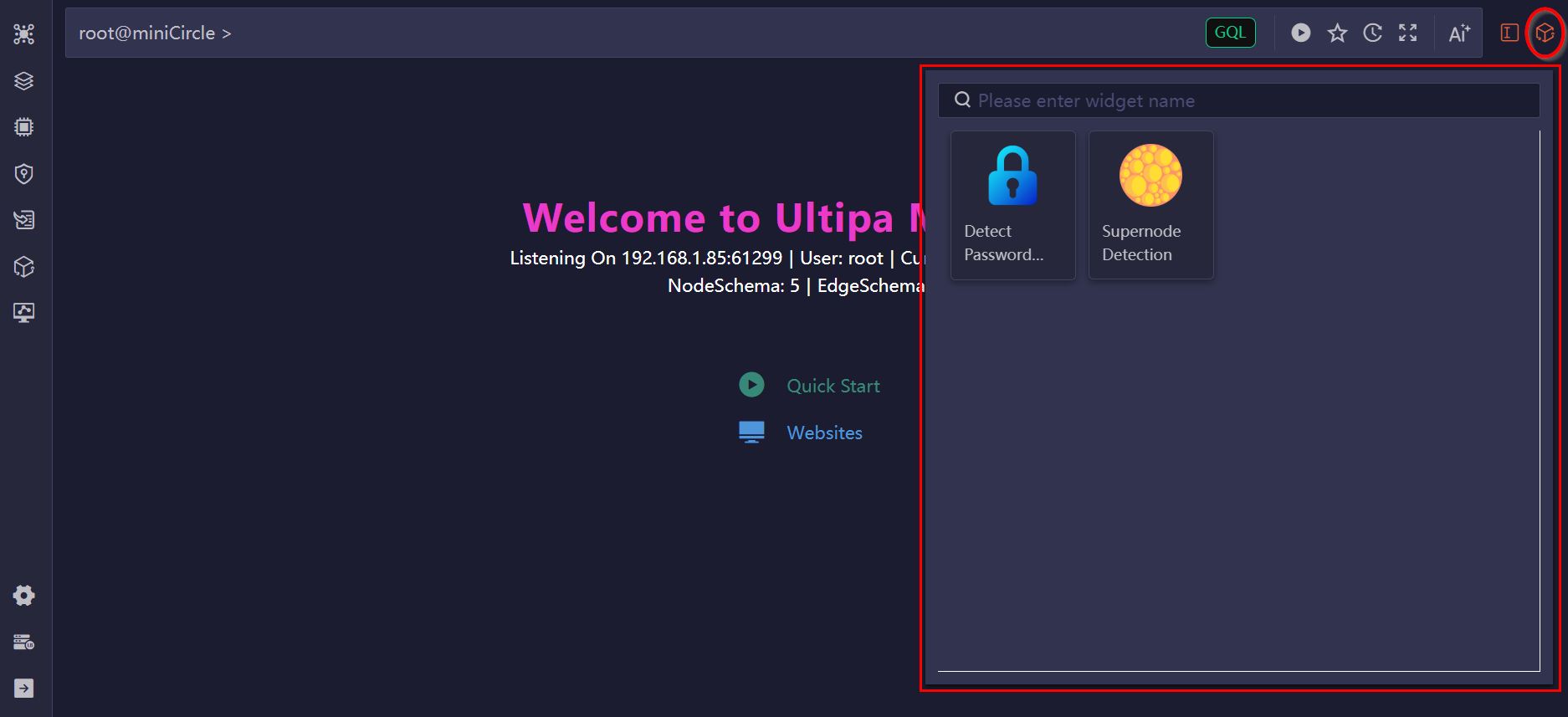
Publish a Widget
Click the Publish button to publish the widget. Once published, you can access it by clicking the Widget icon next to the Editor. The widget will be available across all databases managed under your Manager account.
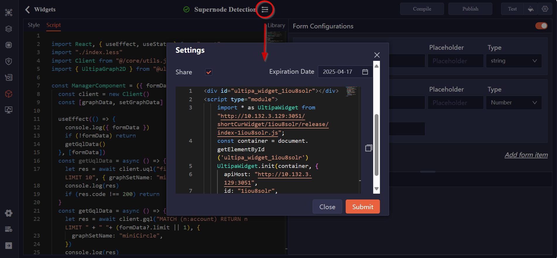
Embed a Widget in Webpages
Click the Settings icon next to the widget name to enable the Share option. This will display a code snippet that you can copy and embed into an HTML file.
Make sure to replace the connectionToken in the code with a valid token generated under Connection Settings > Tokens. The widget can then be executed directly on the webpage until the specified expiration date.
Import/Export Widgets
You can export widgets for backup or sharing purposes, and import them to quickly restore or replicate configurations.